Visit Cardiff
Campaign design, identity
& motion system
Motion System
2025
Motion Identity
Motion Design
Through strategy sessions, creative workshops and a motion-led design process, we developed a motion system that pairs product realism with playful storytelling.
Visit Cardiff approached us with a clear goal: to re-energise Cardiff Bay and remind audiences of everything the city has to offer. Working closely with their team, we developed A Place To…, a strategy-led campaign built around a distinctive motion identity. Through considered motion design, engaging messaging and a vibrant visual language, the campaign showcased Cardiff as a city full of life, energy and opportunity. From digital screens to outdoor advertising, we created a unified brand experience that encouraged audiences to rediscover the capital.
The Challenge
Cardiff Bay is one of the city’s most unique destinations, but it had seen a drop in visitors compared to the city centre. Visit Cardiff needed a campaign that could address this challenge strategically — reigniting interest in the Bay while still promoting the city as a whole. The creative needed to be flexible enough to work across multiple formats and channels, while staying true to Visit Cardiff’s brand identity. It also had to feel warm, modern and dynamic, speaking to both residents and visitors through engaging design and motion.
The Solution
Our strategy centred around the recognisable symbol of place: the location pin. This became the core element of the motion identity, with vivid photography and video masked inside to reveal the city’s highlights. We created a set of messages tailored to different aspects of Cardiff Bay and the city, including A Place to Discover, A Place to Explore, A Place to Reset and A Place to Relax. This adaptable system allowed the campaign to highlight a variety of experiences while maintaining a consistent visual and strategic identity. We produced a full suite of digital and out-of-home assets, using motion design to bring the campaign to life across formats. Every element, from colour and typography to pacing and copy tone, was built on Visit Cardiff’s existing brand foundations, ensuring cohesion while pushing the visual language in a fresh direction. Our strategic approach to content helped make sure each message connected with its intended audience, wherever it appeared.
The Outcome
The A Place To… campaign gave Visit Cardiff a motion identity and design system that could evolve and scale over time. It successfully reconnected audiences with both the Bay and the City Centre, positioning Cardiff as a destination full of culture, creativity and community. Alongside the campaign rollout, we also developed an illustrated map and printed brochure, extending the identity across multiple touchpoints. The result was a consistent, strategy-led campaign that brought motion, storytelling and place together in one cohesive experience.
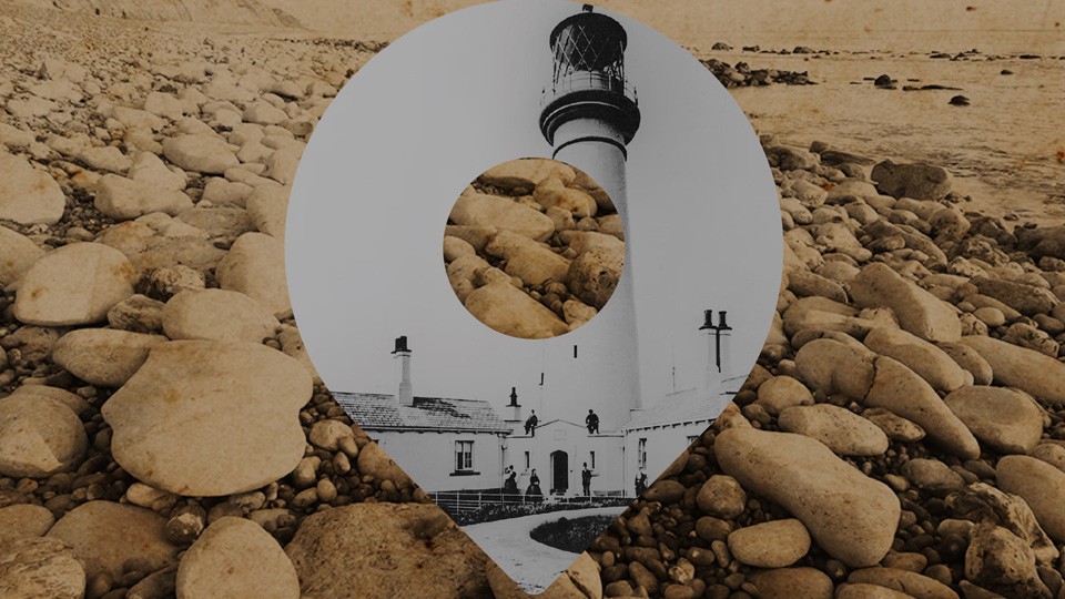
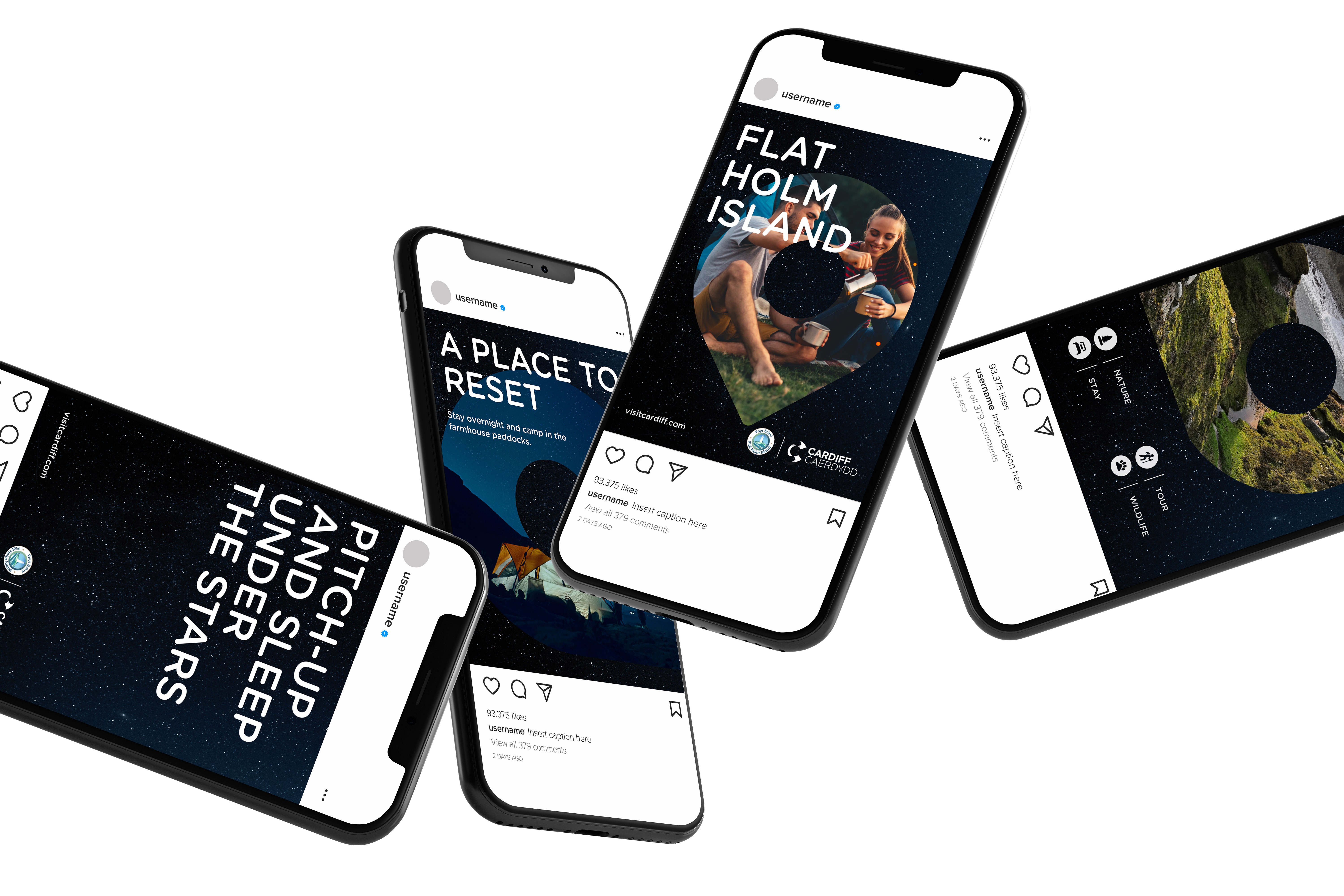
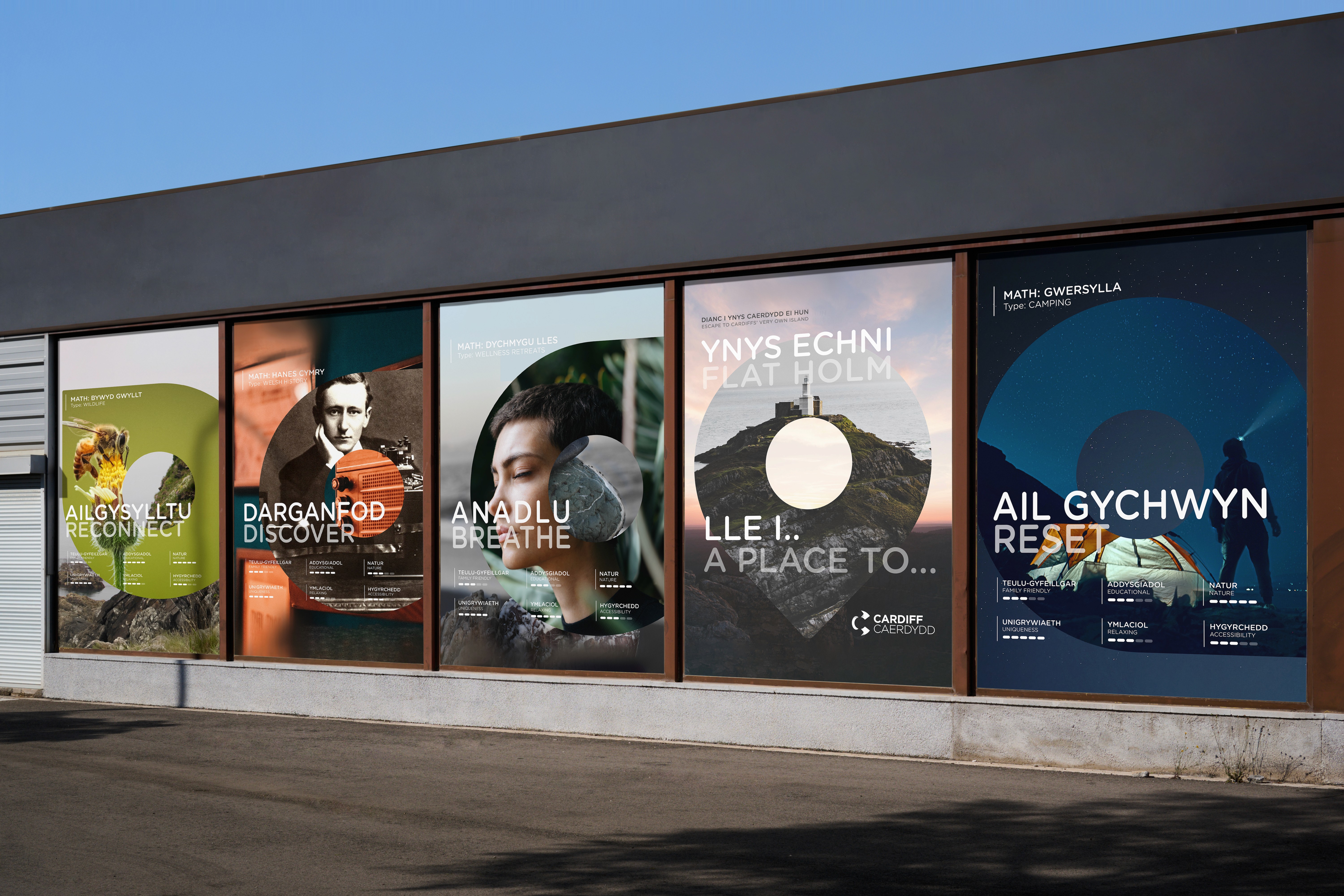
Pin Design
The location pin proved to be an incredibly versatile design element. It acted as a unifying device across all campaign assets, allowing imagery, typography and motion to work together seamlessly. Whether for digital screens, social media, outdoor advertising or printed collateral, the pin could frame different scenes, showcase a variety of experiences and adapt to each format without losing the campaign’s recognisable motion identity.
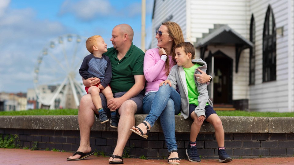
Photography
We directed a series of photoshoots to ensure the imagery across the campaign was consistent and aligned with the motion identity. By controlling lighting, composition and colour, we created a cohesive visual style that could be applied seamlessly across digital, OOH and print assets. This approach ensured every image felt part of the same campaign world, reinforcing Cardiff as a vibrant, dynamic destination.
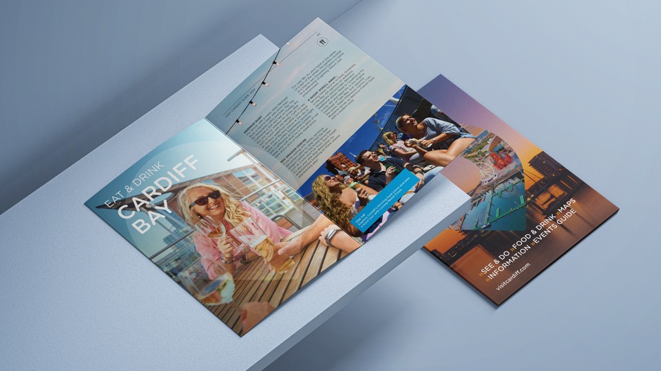
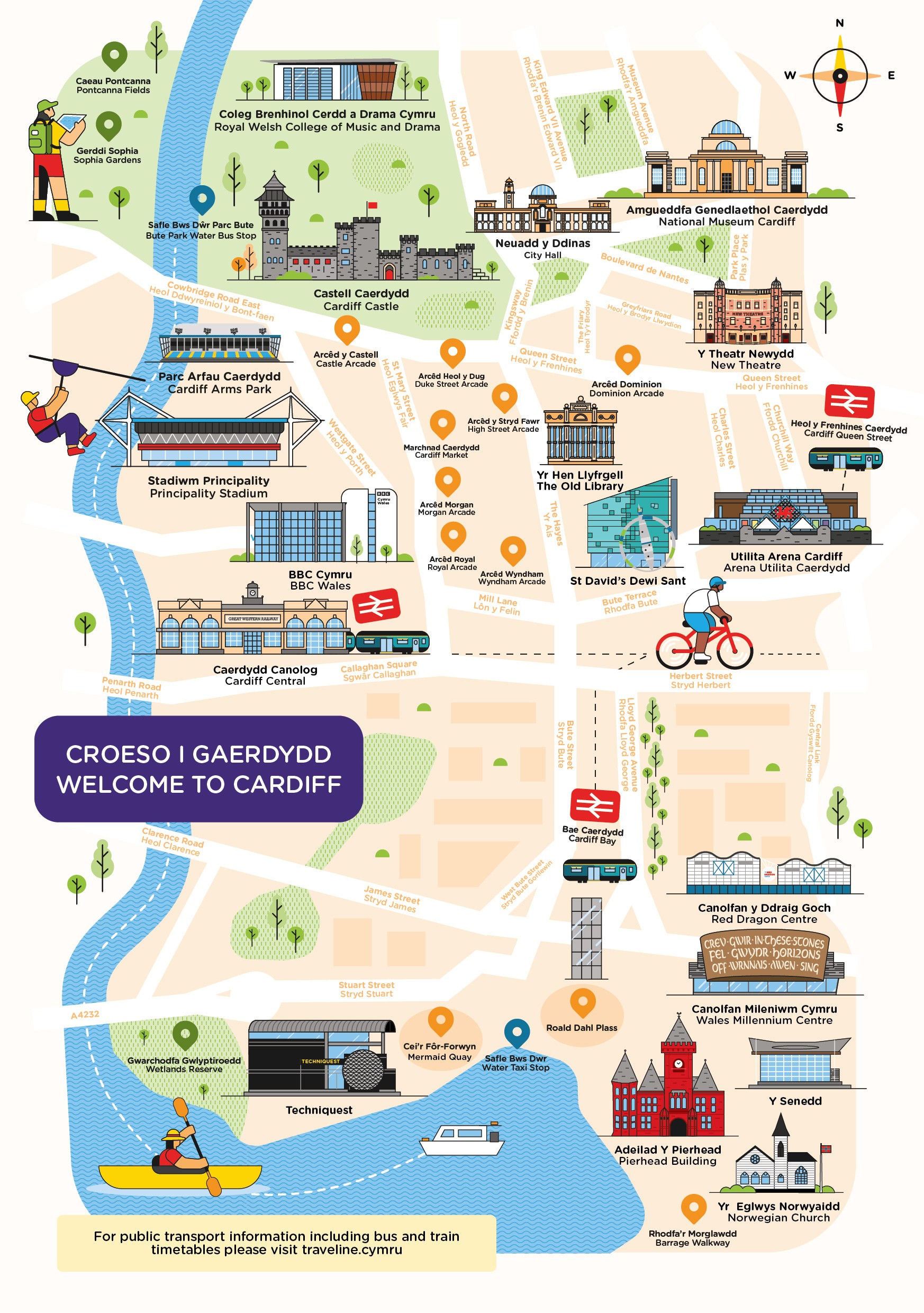
Print Design
On top of the digital campaign assets, we create a suite of printed materials for Cardiff Council to expand their reach. This included brochures detailing things to see and do in Cardiff, posters, and illustrated maps of the city.
Pin Design
The location pin proved to be an incredibly versatile design element. It acted as a unifying device across all campaign assets, allowing imagery, typography and motion to work together seamlessly. Whether for digital screens, social media, outdoor advertising or printed collateral, the pin could frame different scenes, showcase a variety of experiences and adapt to each format without losing the campaign’s recognisable motion identity.
Photography
We directed a series of photoshoots to ensure the imagery across the campaign was consistent and aligned with the motion identity. By controlling lighting, composition and colour, we created a cohesive visual style that could be applied seamlessly across digital, OOH and print assets. This approach ensured every image felt part of the same campaign world, reinforcing Cardiff as a vibrant, dynamic destination.
Print Design
On top of the digital campaign assets, we create a suite of printed materials for Cardiff Council to expand their reach. This included brochures detailing things to see and do in Cardiff, posters, and illustrated maps of the city.
Process
Process
Once the strategic foundations were set, our design team explored how motion could enhance the storytelling. We began by developing the core graphic, the location pin, as a framing device for imagery and type. This formed the basis of a modular design and motion system, allowing assets to adapt easily across formats. The use of colour and typography reflected Visit Cardiff’s brand identity while injecting a sense of vibrancy and movement to capture the energy of the city.
As the campaign evolved, motion design became the heart of the visual experience. The animated pins revealed new scenes through smooth, fluid transitions that echoed the idea of discovery central to the campaign. We extended this visual world beyond advertising, creating an illustrated map and printed materials that showcased the breadth of what Cardiff has to offer. The result was a campaign built on strategy, motion and design, celebrating Cardiff as A Place To… explore, enjoy and experience.
Tell us about your project
Tell us about your project
Tell us about your project
Back to top