PIPS
Brand Motion System
for a Product Launch
Motion System
2025
Motion Identity
Motion Design
Through strategy sessions, creative workshops and a motion-led design process, we developed a motion system that pairs product realism with playful storytelling.
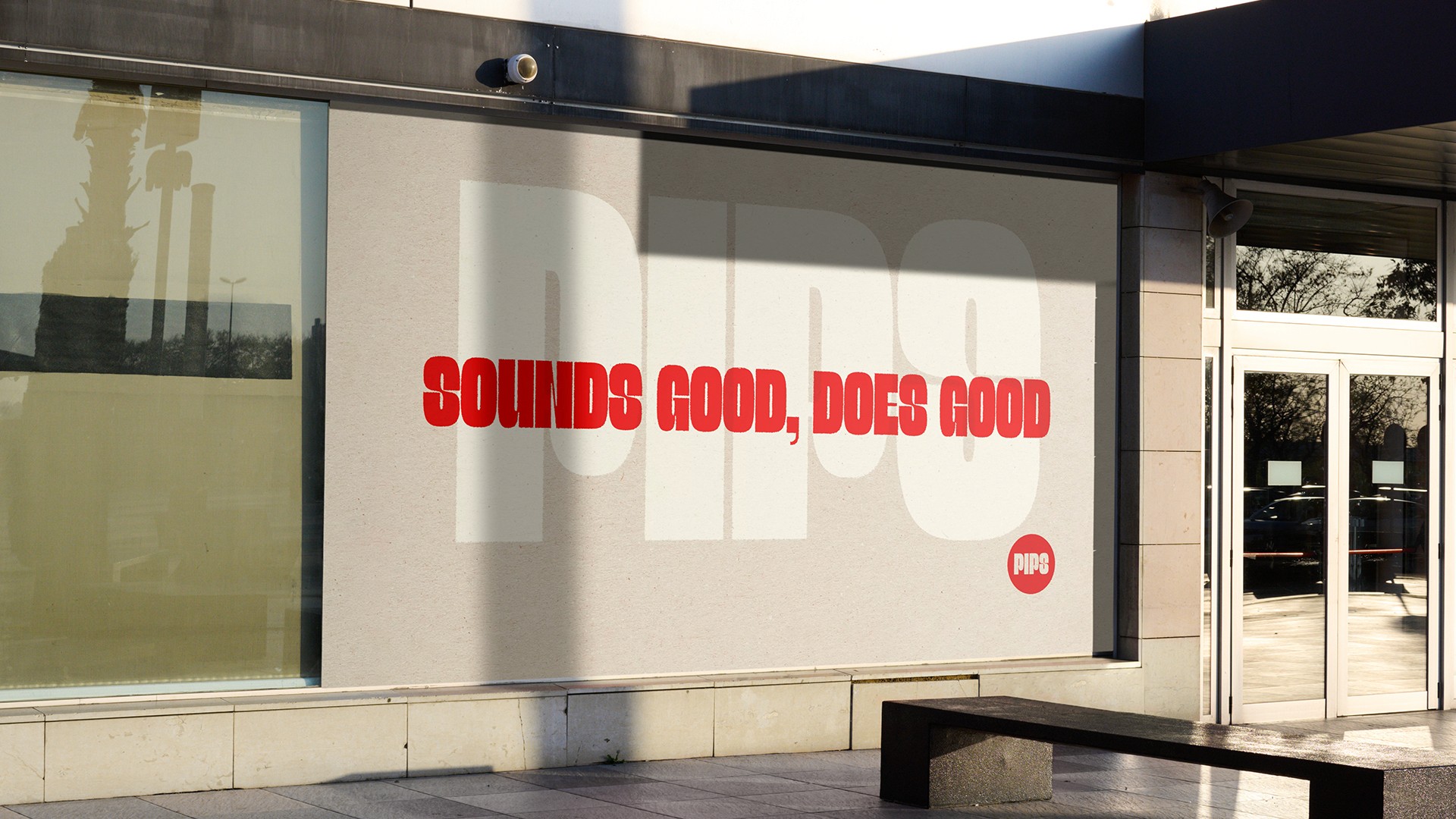
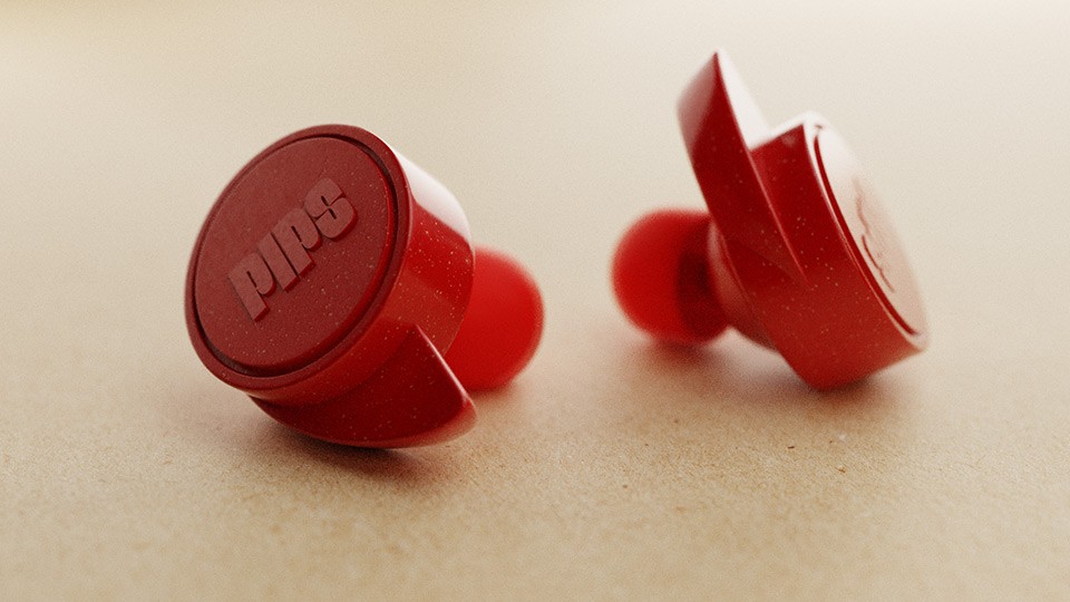
PIPS is a bold, character-led audio brand built for self-expression and conscious living. What truly sets it apart is its purpose: beyond delivering rich sound and standout design, PIPS gives back to the planet. Made using sustainable materials, assembled in fair factories and with user-replaceable batteries, it’s a brand that sounds good and does good. Through playful characters, motion-led storytelling, and planet-positive content, PIPS connects with a generation that cares about the future of music, and the future of the planet.
The Challenge
Launching PIPS meant entering a crowded audio market dominated by global players. The brand needed to stand out, not just through sound quality but by communicating its purpose and personality in a way that resonated with young, planet-conscious audiences. The challenge was to create a brand motion system that could bridge these needs: bold enough to cut through, flexible enough to tell stories across digital platforms, and purposeful enough to reflect the values of sustainability and self-expression. At the same time, the motion identity had to balance two worlds: the tangible, premium product experience and the playful, character-driven storytelling that embodied PIPS’ spirit.
The Solution
We began with a series of brand strategy workshops that clarified PIPS’ purpose, vision and values, and used these foundations to guide every creative decision. From there, we defined a visual and motion direction that would become the heart of the brand’s identity. The motion system combined the precision of 3D product animation with the expressiveness of character-led storytelling. Earbuds and accessories were rendered in high-quality 3D to showcase materiality and design detail, while the world of PIPS characters came alive through animation that blended 2D and 3D techniques. Characters were rigged in Blender using 3D setups but animated to appear as 2D figures, giving them a hand-drawn charm while retaining flexibility and consistency. This dual approach created a unique brand language where products and characters co-existed, allowing us to tell stories about confidence, individuality and sustainability in a dynamic way. Typography, colour and pacing were treated as motion-first principles, ensuring that the brand felt consistent whether in product films, social content or character-led campaigns. Every element contributed to a motion identity that was distinctive, memorable and strategically aligned with PIPS’ positioning as a purpose-driven, youth-focused audio brand.
The Outcome
The result was a brand motion system that gave PIPS a clear and compelling voice in the market. The mix of 3D product animation and character-driven storytelling created a flexible toolkit that could scale across channels, campaigns and future product launches. PIPS’ motion identity not only showcased earbuds as premium and sustainable but also built a vibrant world of characters and narratives that resonated with young people. By leading with motion design and grounding it in brand strategy, we helped PIPS establish itself as more than just an audio brand: it became a platform for creativity, self-expression and conscious living.
3D Modelling
By modelling the product in Blender on top of the brand’s signature paper textures, we balanced modern precision with a nostalgic touch. The hyperrealistic models were then animated across ads and social content, bringing PIPS to life in every motion touchpoint.
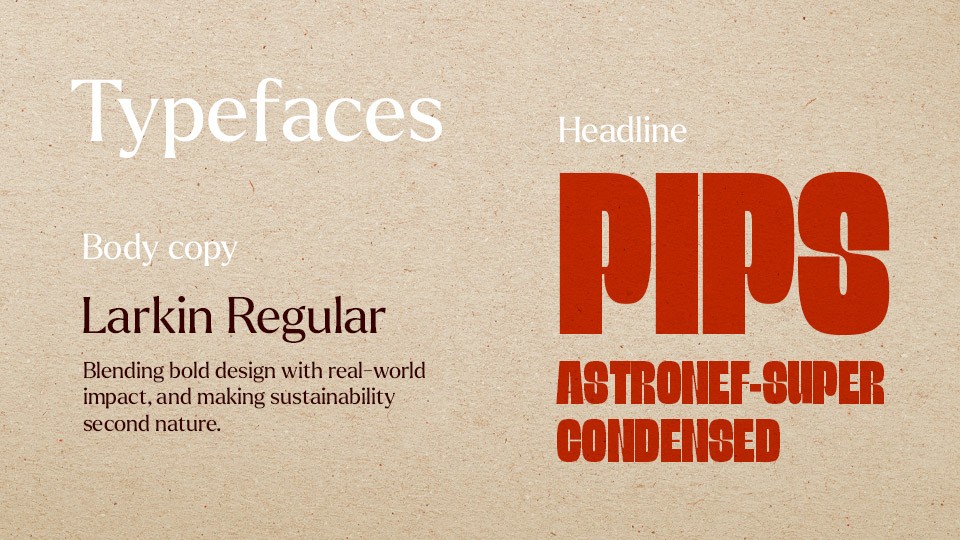
Type System
We chose Astronef Super for its rounded, approachable letterforms. This choice softens the overall identity, making it feel more welcoming.
A key theme in this direction is nostalgia, drawing inspiration from vintage aesthetics and classic eras in music culture. Astronef Super captures that retro spirit, with subtle nods to mid-century type design often seen on old record sleeves, hi-fi branding, and analogue gear. It brings a sense of familiarity and warmth, while still feeling fresh and distinctive within the brand world.
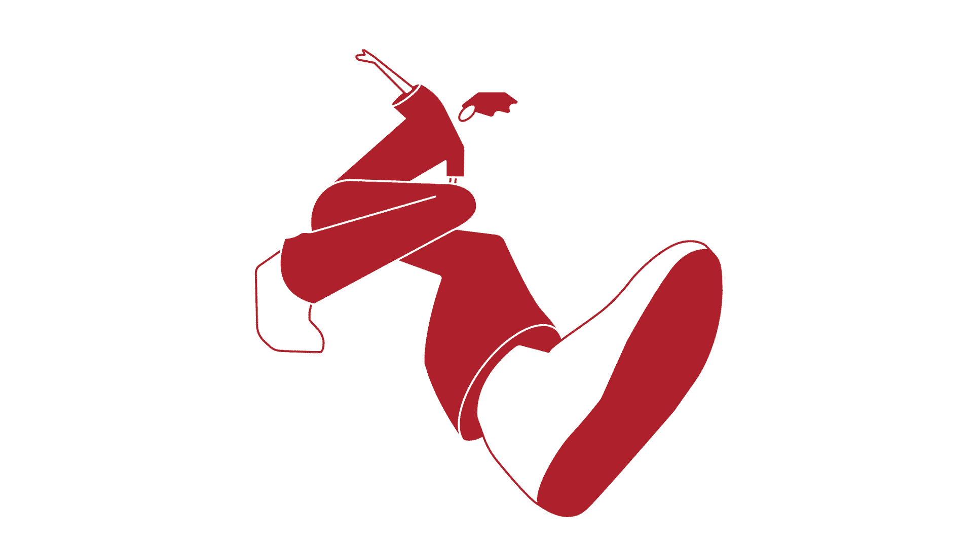
Character Development
The PIPS characters were designed to be bold and flexible, pairing minimal, consistent forms with complex 3D rigs for expressive motion storytelling.
3D Modelling
By modelling the product in Blender on top of the brand’s signature paper textures, we balanced modern precision with a nostalgic touch. The hyperrealistic models were then animated across ads and social content, bringing PIPS to life in every motion touchpoint.
Type System
We chose Astronef Super for its rounded, approachable letterforms. This choice softens the overall identity, making it feel more welcoming.
A key theme in this direction is nostalgia, drawing inspiration from vintage aesthetics and classic eras in music culture. Astronef Super captures that retro spirit, with subtle nods to mid-century type design often seen on old record sleeves, hi-fi branding, and analogue gear. It brings a sense of familiarity and warmth, while still feeling fresh and distinctive within the brand world.
Character Development
The PIPS characters were designed to be bold and flexible, pairing minimal, consistent forms with complex 3D rigs for expressive motion storytelling.
Process
Process
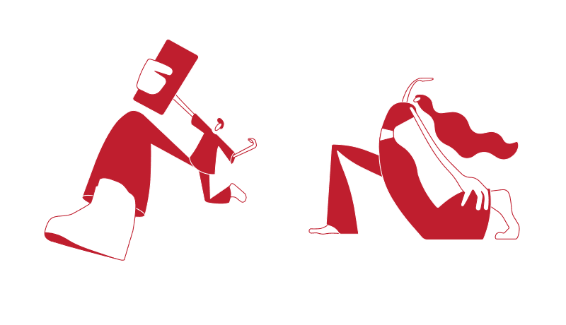
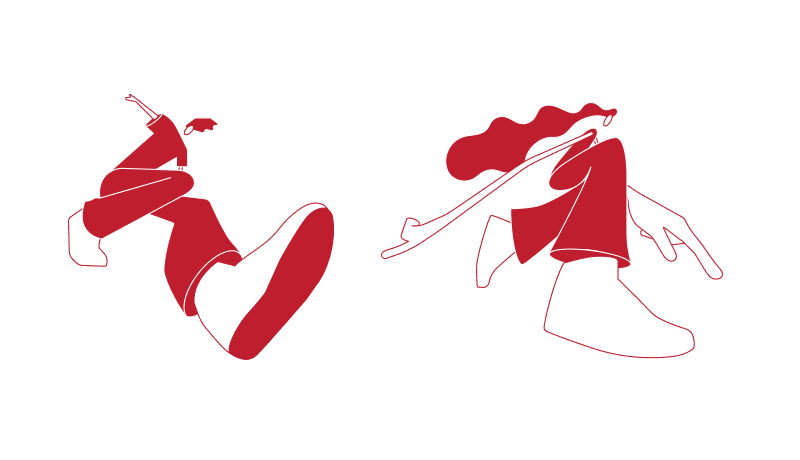
Once the discovery and strategy sessions were complete, our design team turned their attention to character development. The goal was to create a system that could be applied consistently across multiple outputs without relying on too many colour variations. To achieve this, we paired clean-cut, minimalist characters with rough, organic paper textures. This contrast was intentional: it reflected the audience back to themselves, tapping into a desire for traditional methods and process in a world where everything often feels overly polished. By keeping the character style simple, we were able to focus on personality and movement while maintaining flexibility across platforms and content types.
Although the characters appeared two-dimensional, we built and rigged them in Blender as 3D models. This gave us full freedom to animate in three-dimensional space and introduce dynamic camera movement, allowing the storytelling to feel lively and immersive. We also modelled the PIPS earbuds in Blender to ensure the product maintained a realistic presence alongside the stylised characters.
Typography played a key role in the motion identity as well. We chose Astronef Super for its rounded, approachable letterforms, which added warmth and nostalgia to the brand, drawing inspiration from mid-century type often seen on classic record sleeves and analogue audio equipment. Music and sound were also integral to the motion system. We designed waveform blocks that animate in sync with tracks, letting rhythm and audio guide movement throughout the animations and tying sound and motion together as a single expressive language.
Tell us about your project
Tell us about your project
Tell us about your project
Back to top